Yearbook Cover Design
When it comes to yearbooks, people WILL judge your book by its cover. We’ve compiled some important tips to help you create the best yearbook cover design possible for your project.
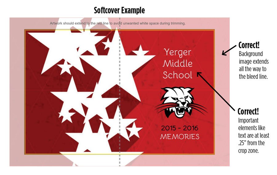
1. Be aware of the wrap zone and crop zone. This will help you avoid unwanted whitespace.
2. Keep important elements such as text and faces at least .25” away from the wrap or crop zones.
3. If you have placed artwork on your cover and want it to be centered or in an exact spot, be aware that adding or deleting pages can cause cover elements to shift. Go back into your cover template and make sure all of your cover elements are positioned the way you intended. To center an object, drag it until you see the center guides appear.
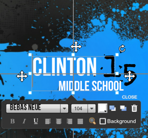
Important note: Text boxes will be centered to the textbox the type is contained in and not the actual type itself. To ensure accuracy, size your box as close to the size of the type as possible and select the centered type option in the type character menu.
4. Don’t forget the back! The backside of your cover is valuable design real estate. Use it to display photos, your mascot, a school seal — get creative!


